业务组件库 [@swing/widget-vue3]🚧 持续迭代中
- 本页面汇总了
@swing/widget-vue3业务组件库的所有组件注意:在 vue 通过插件全局注册,在 template 模版中需要携带 Swing 前缀缩写
S,类似 antdv 中的a-button
安装
使用以下任一命令安装 @swing/widget-vue3
pnpm i @swing/widget-vue3npm i @swing/widget-vue3yarn add @swing/widget-vue3组件总览列表
点击跳转到对应模块或组件详细说明,也可通过页面右侧大纲快速定位 本组件库所有组件注册名均带有统一前缀
s-,实际注册名为s-组件名小写中横线,如UserAvatarWithOrg实际注册为s-user-avatar-with-org。
| 所属模块 | 组件名 | 备注 |
|---|---|---|
| system | UserAvatarWithOrg | 人员头像,人员信息和组织机构信息的展示组件 |
| UserAssignmentModal | 穿梭框选择用户的组件 | |
| SelectUser | 下拉框选择用户组件 | |
| SelectUserByModal | 输入框点击弹出模态框,选择用户组件 | |
| AvatarDropdown | 用户下拉菜单组件 | |
| MentionUsers | 用户提及组件 | |
| OrganizationCascader | 组织机构级联选择组件 | |
| OrganizationTreeSelect | 组织机构树形选择组件 | |
| CommentList | 评论列表组件 | |
| LabelPrinting | 标签打印组件 | |
| gds | SelectDictionary | 选择字典组件 |
| CalendarDateTag | 工作日历标签组件 | |
| EncodingGenerate | 编码生成组件 | |
| iot | IotPointSelect | IOT测点选择组件 |
| IotDeviceCascader | IOT设备级联选择组件 | |
| IotMeasurementPointChart | IOT测点图标展示组件 | |
| flow | SubmitForApproval | 流程发起 |
| ProcessApproval | 流程审批 | |
| ProcessStatus | 流程状态/流程审批人展示 | |
| notice | AppMessageTabCard | 应用内消息组件 |
| NoticeList | 消息列表组件 | |
| NoticeOption | 消息选项组件 |
🗂️ 系统管理 [System]
简介
专为系统管理设计的 Vue 组件集合,提供用户管理、组织机构管理、评论等前端组件,支持下拉框选择用户、组织架构展示、评论交互等功能。
总览
| 组件名 | 说明 |
|---|---|
| userAvatarWithOrg | 用户头像和组织信息展示组件 |
| userAssignmentModal | 穿梭框选择用户组件 |
| selectUser | 下拉框选择用户组件 |
| selectUserByModal | 出模态框选择用户组件 |
| avatarDropdown | 用户头像下拉菜单组件 |
| mentionUser | 用户提及组件 |
| organizationCascader | 组织机构级联选择组件 |
| organizationTreeSelect | 组织机构树形选择组件 |
| commentList | 评论列表组件 |
| labelPrinting | 标签打印组件 |
用户头像与组织
使用场景
展示用户头像、人员信息和组织机构信息的组合组件
代码示例
<template>
  <s-user-avatar-with-org :user="userInfo" :show-org="true" size="large" />
</template>

<script setup>
const userInfo = ref({
  name: "张三",
  avatar: "/avatar.jpg",
  organization: {
    name: "技术部",
  },
});
</script>
API
| 参数 | 说明 | 类型 | 默认值 | 必填 |
|---|---|---|---|---|
| user | 用户信息对象 | object | - | true |
| showOrg | 是否显示组织信息 | boolean | true | false |
| size | 头像大小 | 'small' | 'default' | 'large' | 'default' | false |
| showName | 是否显示用户名 | boolean | true | false |
穿梭框选择用户
使用场景
通过穿梭框形式选择用户的模态框组件,适用于批量用户分配场景
代码示例
<template>
  <s-user-assignment-modal
    v-model:visible="visible"
    :selected-users="selectedUsers"
    @confirm="handleConfirm"
  />
</template>

<script setup>
const visible = ref(false);
const selectedUsers = ref([]);

const handleConfirm = (users) => {
  console.log('选中的用户:', users);
  selectedUsers.value = users;
  visible.value = false;
};
</script>
API
| 参数 | 说明 | 类型 | 默认值 | 必填 |
|---|---|---|---|---|
| visible | 是否显示模态框 | boolean | false | true |
| selectedUsers | 已选中的用户列表 | array | [] | false |
| title | 模态框标题 | string | '用户分配' | false |
| width | 模态框宽度 | string | number | 800 | false |
| maxCount | 最大可选用户数 | number | - | false |
下拉框选择用户
使用场景
下拉框形式选择用户的组件,支持搜索和单选/多选
代码示例
<template>
  <s-select-user
    v-model:value="selectedUsers"
    :multiple="true"
    placeholder="请选择用户"
    :max-tag-count="3"
    @change="handleUserChange"
  />
</template>

<script setup>
const selectedUsers = ref([]);

const handleUserChange = (users) => {
  console.log("选中的用户:", users);
};
</script>
API
| 参数 | 说明 | 类型 | 默认值 | 必填 |
|---|---|---|---|---|
| value | 选中的用户值 | string | array | - | false |
| multiple | 是否支持多选 | boolean | false | false |
| placeholder | 占位符文本 | string | '请选择用户' | false |
| disabled | 是否禁用 | boolean | false | false |
| allowClear | 是否允许清空 | boolean | true | false |
| maxTagCount | 多选时最多显示标签数 | number | 3 | false |
模态框选择用户
使用场景
输入框点击弹出模态框选择用户的组件,适用于需要搜索和选择用户的场景
代码示例
<template>
  <s-select-user-by-modal
    v-model:value="selectedUser"
    placeholder="请选择用户"
    :multiple="false"
    @change="handleUserChange"
  />
</template>

<script setup>
const selectedUser = ref(null);

const handleUserChange = (user) => {
  console.log('选中的用户:', user);
};
</script>
API
| 参数 | 说明 | 类型 | 默认值 | 必填 |
|---|---|---|---|---|
| value | 选中的用户值 | object | array | - | false |
| placeholder | 输入框占位符 | string | '请选择用户' | false |
| multiple | 是否支持多选 | boolean | false | false |
| disabled | 是否禁用 | boolean | false | false |
| allowClear | 是否允许清空 | boolean | true | false |
头像下拉菜单
使用场景
用户头像下拉菜单组件,通常用于显示用户信息和相关操作选项
代码示例
<template>
  <s-avatar-dropdown
    :user="currentUser"
    :menu-items="menuItems"
    @menu-click="handleMenuClick"
  />
</template>

<script setup>
const currentUser = ref({
  name: "张三",
  avatar: "/avatar.jpg",
  email: "zhangsan@example.com",
});

const menuItems = ref([
  { key: "profile", label: "个人资料", icon: "UserOutlined" },
  { key: "settings", label: "设置", icon: "SettingOutlined" },
  { key: "logout", label: "退出登录", icon: "LogoutOutlined" },
]);

const handleMenuClick = (key) => {
  console.log("点击菜单项:", key);
};
</script>
API
| 参数 | 说明 | 类型 | 默认值 | 必填 |
|---|---|---|---|---|
| user | 用户信息对象 | object | - | true |
| menuItems | 菜单项配置 | array | [] | false |
| size | 头像大小 | 'small' | 'default' | 'large' | 'default' | false |
| placement | 下拉菜单位置 | string | 'bottomRight' | false |
用户提及
使用场景
支持在文本输入中提及用户的组件,类似社交媒体的
@功能
代码示例
<template>
  <mention-user
    v-model:value="content"
    :users="userList"
    placeholder="请输入内容,使用@提及用户"
    @mention="handleMention"
  />
</template>

<script setup>
const content = ref("");
const userList = ref([
  { id: "1", name: "张三", avatar: "/avatar1.jpg" },
  { id: "2", name: "李四", avatar: "/avatar2.jpg" },
]);

const handleMention = (user) => {
  console.log("提及用户:", user);
};
</script>
API
| 参数 | 说明 | 类型 | 默认值 | 必填 |
|---|---|---|---|---|
| value | 输入框的值 | string | '' | false |
| users | 可提及的用户列表 | array | [] | false |
| placeholder | 占位符文本 | string | '请输入内容' | false |
| disabled | 是否禁用 | boolean | false | false |
| maxLength | 最大输入长度 | number | - | false |
组织机构级联选择
使用场景
级联选择器形式的组织机构选择组件,支持多级组织架构选择
代码示例
<template>
  <s-organization-cascader
    v-model:value="selectedOrgs"
    placeholder="请选择组织机构"
    :multiple="false"
    :show-search="true"
    @change="handleOrgChange"
  />
</template>

<script setup>
const selectedOrgs = ref([]);

const handleOrgChange = (orgs) => {
  console.log('选中的组织机构:', orgs);
};
</script>
API
| 参数 | 说明 | 类型 | 默认值 | 必填 |
|---|---|---|---|---|
| value | 选中的组织机构值 | string | array | - | false |
| placeholder | 占位符文本 | string | '请选择组织机构' | false |
| multiple | 是否支持多选 | boolean | false | false |
| showSearch | 是否支持搜索 | boolean | true | false |
| disabled | 是否禁用 | boolean | false | false |
| allowClear | 是否允许清空 | boolean | true | false |
组织机构树形选择
使用场景
树形选择器形式的组织机构选择组件,以树形结构展示组织架构
代码示例
<template>
  <s-organization-tree-select
    v-model:value="selectedOrgs"
    placeholder="请选择组织机构"
    :tree-checkable="true"
    :show-checked-strategy="SHOW_PARENT"
    @change="handleOrgChange"
  />
</template>

<script setup>
import { TreeSelect } from "ant-design-vue";
const { SHOW_PARENT } = TreeSelect;

const selectedOrgs = ref([]);

const handleOrgChange = (orgs) => {
  console.log("选中的组织机构:", orgs);
};
</script>
API
| 参数 | 说明 | 类型 | 默认值 | 必填 |
|---|---|---|---|---|
| value | 选中的组织机构值 | string | array | - | false |
| placeholder | 占位符文本 | string | '请选择组织机构' | false |
| treeCheckable | 是否支持多选 | boolean | false | false |
| showCheckedStrategy | 多选时的显示策略 | enum | SHOW_PARENT | false |
| disabled | 是否禁用 | boolean | false | false |
| allowClear | 是否允许清空 | boolean | true | false |
评论列表
使用场景
展示评论列表的组件,支持评论的增删改查和分页展示
代码示例
<template>
  <s-comment-list
    :comments="commentData"
    :loading="loading"
    :current-user="currentUser"
    @add-comment="handleAddComment"
    @delete-comment="handleDeleteComment"
  />
</template>

<script setup>
const commentData = ref([]);
const loading = ref(false);
const currentUser = ref({
  id: "1",
  name: "张三",
  avatar: "/avatar.jpg",
});

const handleAddComment = (comment) => {
  console.log("添加评论:", comment);
};

const handleDeleteComment = (commentId) => {
  console.log("删除评论:", commentId);
};
</script>
API
| 参数 | 说明 | 类型 | 默认值 | 必填 |
|---|---|---|---|---|
| comments | 评论数据列表 | array | [] | false |
| loading | 加载状态 | boolean | false | false |
| currentUser | 当前用户信息 | object | - | true |
| showAvatar | 是否显示头像 | boolean | true | false |
| showActions | 是否显示操作按钮 | boolean | true | false |
标签打印
使用场景
应用于需要批量生成、打印标签的业务场景
代码示例
<template>
  <s-label-printing label-code="TEST-CODE" :template-ids="[]" />
</template>

<script setup></script>
API
| 参数 | 说明 | 类型 | 默认值 | 必填 |
|---|---|---|---|---|
| labelCode | 标签模板编码 | string | - | true |
| templateIds | 匹配值列表 | string[] | - | true |
| icon | 标签打印图标 | IconType | PrinterOutlined(antd-vue-icon) | false |
| divider | 分割线 | "left" | "right" | null | null | false |
| fields | 数据库表中的字段名(列名) | string | id | false |
🗂️ 通用数据管理服务 [Gds]
简介
专为通用数据管理设计的 Vue 组件集合,提供数据字典选择、编码生成、工作日历标签等前端组件。
总览
| 组件名 | 说明 |
|---|---|
| encodingGenerate | 编码生成组件 |
| selectDictionary | 数据字典选择组件 |
| calendarDateTag | 工作日历标签组件 |
编码生成
使用场景
基于编码规则配置生成特定的编码值
代码示例
<template>
  <encoding-generate ruleCode="TEST" :isCreate="id" businessCode="01" />
</template>

<script setup>
const id = ref('');
</script>
API
| 参数 | 说明 | 类型 | 默认值 | 必填 |
|---|---|---|---|---|
| isCreate | 是否在表单创建时使用 | boolean | null | true |
| ruleCode | 编码规则编码 | string | null | true |
| businessCode | 业务参数 | string | null | false |
数据字典选择
使用场景
从字典项下拉选择特定的字典项
代码示例
<template>
  <select-dictionary ref="dictionary" />
</template>

<script setup>
const dictionary = ref();

// 获取字典项数据
dictionary.value?.getOptions();
</script>
API
| 参数 | 说明 | 类型 | 默认值 | 必填 |
|---|---|---|---|---|
| code | 字典项代码 | string | null | true |
| getOptions() | 获取字典项数据 | void | - | - |
工作日历标签
使用场景
用于标记工作日期和法定节假日日期
代码示例
<template>
  <calendar-date-tag :workday="true" :holiday="false" :closable="true" />
</template>
API
| 参数 | 说明 | 类型 | 默认值 | 必填 |
|---|---|---|---|---|
| workday | 是否为工作日 | boolean | false | false |
| holiday | 是否为法定节假日 | boolean | false | false |
| closable | 是否可以关闭 | boolean | false | false |
| 其他属性 | 参考 Ant Design Vue Tag | - | - | - |
🗂️ 工业数据服务 [Iot]
简介
专为 IoT 平台设计的 Vue 组件集合,提供设备选择、测点选择、实时数据展示等前端组件。
总览
| 组件名 | 说明 |
|---|---|
| iotPointSelect | 数据测点选择 |
| iotDeviceCascader | 设备级联选择 |
| iotMeasurementPointChart | 测点数据折线图 |
数据测点选择
何时使用
用户从下拉菜单中,选择特定设备的数据测点
代码演示
<template>
  <iot-point-select :deviceId="deviceId" v-model:value="pointId" />
</template>

<script>
const deviceId = ref<string>('device-id')
const pointId = ref<string>()
</script>
API
参数 | 说明 | 类型 | 默认值 | 必填 |
|---|---|---|---|---|
| deviceId | 设备 Id | string | - | true |
| mode | 设置 Select 的模式为多选或标签 | multiple | tags |combobox | multiple | false |
| allowClear | 支持清除 | boolean | true | false |
| showSearch | 配置是否可搜索 | boolean | 单选为 false,多选为 true | false |
| placeholder | 选择框默认文字 | string | 请选择测点 | false |
| 其余 API | https://www.antdv.com/components/select-cn#api | - | - | - |
设备级联选择
何时使用
用户从级联选择中,选择特定设备
代码演示
<template>
  <iot-device-cascader v-model:value="deviceId" @change="onChange" />
</template>

<script>
const deviceId = ref<string>()

const onChange = (value: string) => {
    console.log(value)
}
</script>
API
参数 | 说明 | 类型 | 默认值 | 必填 |
|---|---|---|---|---|
| allowClear | 支持清除 | boolean | true | false |
| showSearch | 配置是否可搜索 | boolean | false | false |
| placeholder | 选择框默认文字 | string | 请选择设备 | false |
| 其余 API | https://www.antdv.com/components/cascader-cn#api | - | - | - |
测点数据折线图
何时使用
用户需要查看某个测点的走势及数据时使用
代码演示
<template>
  <iot-measurement-pointChart
    :deviceCode="deviceCode"
    :pointCode="pointCode"
    :params="range"
  />
</template>

<script>
const formState = reactive<{ deviceCode: string; pointCode: string; range: EndPointListQueryParameter }>({
  deviceCode: 'device-01',
  pointCode: 'point-01',
  range: undefined,
})
</script>
API
参数 | 说明 | 类型 | 默认值 | 必填 |
|---|---|---|---|---|
| deviceCode | 设备编码 | string | - | true |
| pointCode | 测点编码 | string | - | true |
| range | 日期范围 | EndPointListQueryParameter | - | false |
Props
export declare interface EndPointListQueryParameter extends QueryParameter {
  /** Query condition: 开始时间 (用于匹配某一个时间区间时使用)单位:s */
  from?: string;
  /** Query condition: 结束时间 (用于匹配某一个时间区间时使用)单位:s */
  to?: string;
}
🗂️ 工作流 [Flow]
简介
专为流程中心设计的 Vue 组件集合,提供流程状态/审批人预览前端组件。
总览
| 组件名 | 说明 |
|---|---|
| SubmitForApproval | 流程发起 |
| ProcessApproval | 流程审批 |
| processStatus | 流程状态/审批人预览 |
流程发起
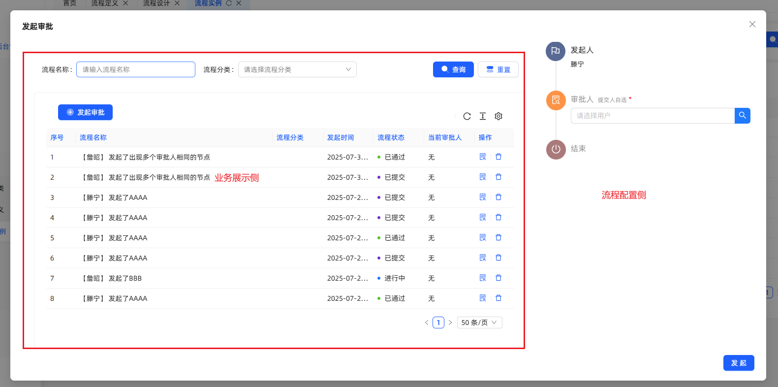
何时使用
业务场景需要发起工作流进行审批的时候,使用此组件。
代码演示
<template>
    <SubmitForApproval
        model-key="AAAA"
        business-id="123"
        :user-info="userStore.currentUser"
        v-permission="'xxxx-add'"
        button-type="button"
        @handleAdd="
        () => {
          reload();
        }
        "
    >
      <icon-add style="font-size: 1.25em; margin-right: -0.12em; vertical-align: -0.23em" />
      <span>发起审批</span>
    </SubmitForApproval>
</template>
<script setup>
  import SubmitForApproval from '@/components/workflow/SubmitForApproval/index.vue';
</script>
API
参数 | 说明 | 类型 | 默认值 | 必填 |
|---|---|---|---|---|
| modelKey | 模型key | string | true | |
| businessId | 业务ID | String | "" | false |
| userInfo | 用户信息 | User | true | |
| hideForm | 是否隐藏Form展示 | Boolean | false | false |
| buttonType | 发起按钮类型 | String | a | false |
| disabled | 是否禁用 | Boolean | false | false |
| formContent | 表单数据 | Record<string, any> | null | false |
emits
参数 | 说明 | 类型 | 默认值 | 必填 |
|---|---|---|---|---|
| handle | 审批成功回调 | Function | false |
流程审批
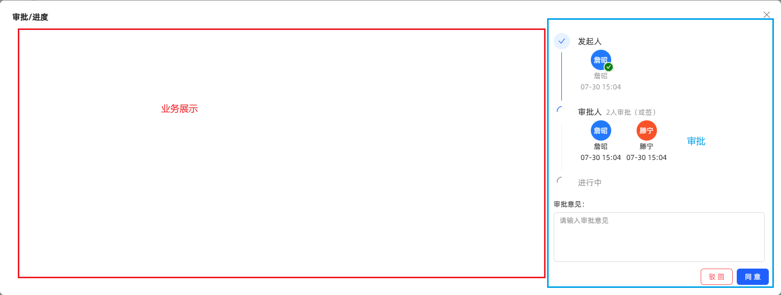
何时使用
业务场景需要工作流进行审批的时候,使用此组件。
代码演示
<template>
  <process-approval
      :user-info="userStore.currentUser"
      :process-instance-id="record.processInstanceId"
      style="padding: 0"
      v-permission="'xxxx-approval'"
  >
    <a-tooltip>
      <template #title>审批/进度</template>
      <SolutionOutlined />
    </a-tooltip>
  </process-approval>
</template>
<script setup>
    import ProcessApproval from '@/components/workflow/ProcessApproval/index.vue';
</script>
API
参数 | 说明 | 类型 | 默认值 | 必填 |
|---|---|---|---|---|
| businessId | 业务ID | string | "" | false |
| processInstanceId | 实例ID | String | true | |
| userInfo | 用户信息 | User | true | |
| hideForm | 是否隐藏Form展示 | Boolean | false | false |
| buttonType | 发起按钮类型 | String | a | false |
| disabled | 是否禁用 | Boolean | false | false |
emits
参数 | 说明 | 类型 | 默认值 | 必填 |
|---|---|---|---|---|
| handle | 审批成功回调 | Function | false |
流程状态
该组件分两种形态,一种显示流程状态,另一种显示当前审批人。 可通过配置miniInfo属性,切换形态。 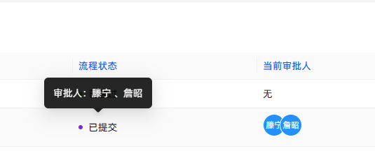
何时使用
业务场景需要展示工作流当前审批状态或者当前审批人时候,使用此组件。
代码演示
<template>
    <processStatus
      :process-instance-id="record.id"
       mini-info
    />
</template>
<script setup>
    import { ProcessStatus } from '@swing/widget-vue3'
</script>
API
参数 | 说明 | 类型 | 默认值 | 必填 |
|---|---|---|---|---|
| processInstanceId | 流程实例ID | string | "" | 与processInstanceData二选一 |
| processInstanceData | 流程实例详情 | Instance | null | 与processInstanceId二选一 |
| miniInfo | 显示状态切换 | boolean | false | false |
🗂️ 消息通知 [Notice]
简介
消息中心是不同模块、服务或系统之间传递消息的中介角色,让用户和系统之间的消息更方便、快捷的触达到指定用户或系统,以此来提升效率和降低成本。
总览
| 组件名 | 说明 |
|---|---|
| noticeOption | 消息铃铛 |
| noticeList | 消息列表 |
| appMessageTabCard | 消息卡片 |
消息铃铛
何时使用
平台默认已有功能,业务场景如有需求也可使用。
代码演示
<template>
  <notice-option :currentUser="user"/>
</template>

<script>
  const user = ref < User > (null)
</script>
API
参数 | 说明 | 类型 | 默认值 | 必填 |
|---|---|---|---|---|
| minWidth | 最小宽度 | string | 300px | false |
| icon | 图标 | VNode | - | false |
| iconClassName | icon图标类名 | string | - | false |
| placement | 下拉列表位置 | bottomLeft | bottom |bottomRight |topLeft |top |topRight | bottomLeft | false |
| divider | icon 图标隔离线 | left | right | - | false |
| currentUser | 当前登录的用户 | User | - | false |
| siteId | 站点ID | string | - | false |
| messageSubjectCode | 消息主题编码 | string | - | false |
| showClearAction | 消息主题编码 | boolean | true | false |
| title | 标题 | string | 未读消息 | false |
| clearText | 清除文本 | string | 清空 | false |
| emptyText | 空文本 | string | 你已查看所有通知 | false |
消息列表
何时使用
用于展示应用内的消息列表组件,消息数据需要自己传递。
代码演示
<template>
  <notice-list :list="messageList"/>
</template>

<script>
  const messageList = ref < MessageReceiveVO[] > ([])
</script>
API
参数 | 说明 | 类型 | 默认值 | 必填 |
|---|---|---|---|---|
| list | 消息列表数据 | MessageReceiveVO[] | - | false |
| onClick | 点击消息回调 | (item: MessageReceiveVO) => void | - | false |
| emptyText | 列表为空时显示的文本 | string | 暂无数据 | false |
| loading | 加载中loading | boolean | false | false |
消息卡片
何时使用
用于展示应用内的消息列表,消息数据默认查询。
代码演示
<template>
  <app-message-tab-card />
</template>

<script></script>
API
参数 | 说明 | 类型 | 默认值 | 必填 |
|---|---|---|---|---|
| currentUser | 当前登录的用户 | User | - | false |
| isAllMessage | 是否显示所有的消息 | boolean | false | false |
| siteId | 站点 ID | string | - | false |
| messageSubjectCode | 消息主题编码 | string | - | false |
总结
通过使用 @swing/widget-vue3,可以给业务开发提供通用组件,减少业务开发的重复代码。